

Step 1 – How to use the interactive dashboardl
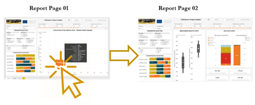
The dashboard consists of three pages/ tabs.
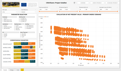
The visualisations in the interactive dashboard represent a piece of information like for example the life cycle costs or relating CO2 emissions of selected variants. Within the dashboard, users can add and remove data, change visualisation types, and apply filters. The idea of this interactive dash-board is to allow users of the pinboard to dig into the data and discover insights and look for optimal solutions that can also be applied for their nZEB developments. The web-report is highly interactive and highly customizable, and the visualisations update as the underlying data changes. Buttons at the bottom of a report can be used to navigate between pages. Also reports can be viewed full-screen, and users can save/print a screenshot of the report using the print option.
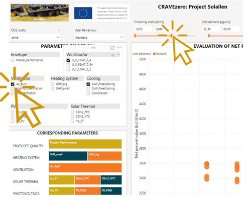
Step 2 – Interaction with filtersFilters/slicers allow users of the dashboard to narrow the cost and energy-related data that is visualised on a page.Multiple filters, can be selected to narrow down the dataset. To remove a filter, users can deselect all filtered values. Example: All variations of the life cycle cost and performance optimisation are ini-tially shown for the building. Selecting, for exam-ple, a special heating system or filtering a life cycle cost range in the visualisations shows only data for that heating system or life cycle cost range in the visualisations. |
|
|
Step 3 – Cross-highlighting related visualisationsThe visualisations on a single report are "connect-ed" to each other. If one or more values are se-lected in one visualisation, other visualisations will change based on that selection. |
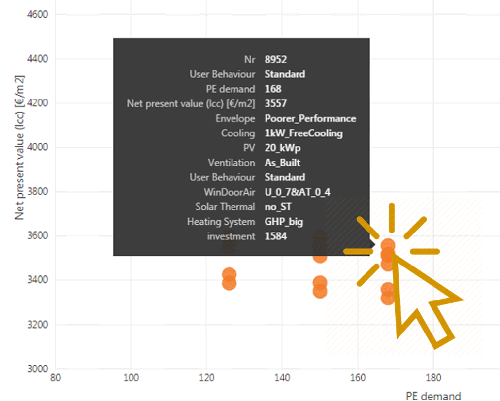
Step 3 – Hover effects of visualsIf the cursor is placed on a variant, users can find out more about a selected variant. The cursor needs to be placed over any visual element in the dashboard in order to view detailed data. |
|
|
Step 4 – Export dashboard dataData can be exported out of the visual via the Export data option. The resulting .csv file will contain all the data presented in a visual and will respect any filters applied to the data. |
Go to the Interactive Dashboard |