
Overview
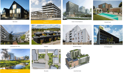
ValaGard
AspernIQ
Greenhome
Lodenareal
Sollalen
Alizari
Les Heliades
IsolaNelVerde
More
iuR HQ

How to use the interactive dashboard
In this interactive dashboard, parametric calculations for high performing nearly zero energy buildings can be performed with defined key performance indicators: financing costs, life cycle costs, balanced primary energy demand and balanced CO2 emissions. The CRAVEzero-Dashboard is a consistent continuation of the work in WP6 of the CRAVEzero project on the energetic-economic optimization of highly efficient buildings in all life cycle phases. The calcualtion method for this dashboard is documented in Deliverable D6.1 “Parametric models for buildings and building clusters on the Cravezero.eu website.
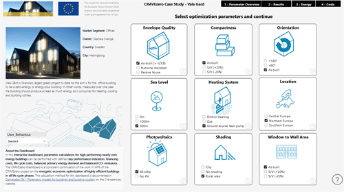
Step 1 – Select a CRAVEzero case studyChoose one out of the many case studies from the CRAVEzero project to start the parametric calculations.One you have selected a case study a new window with a Dashboard will load (this might take a few seconds) |
|
|
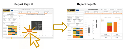
Step 1 – Parameter SelectionDashboard - Starting Page: Select building parameters to optimize...The idea of this interactive dash-board is to allow users of the pinboard to dig into the data and discover insights and look for optimal solutions that can also be applied for their nZEB developments. The web-report is highly interactive and highly customizable, and the visualisations update as the underlying data changes. Buttons at the bottom of a report can be used to navigate between pages. |
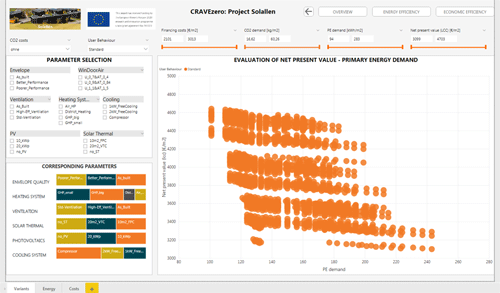
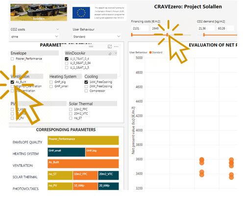
Step 2 – Interaction with filtersFilters/slicers allow users of the dashboard to narrow the cost and energy-related data that is visualised on a page.Multiple filters, can be selected to narrow down the dataset. To remove a filter, users can deselect all filtered values. Example: All variations of the life cycle cost and performance optimisation are ini-tially shown for the building. Selecting, for exam-ple, a special heating system or filtering a life cycle cost range in the visualisations shows only data for that heating system or life cycle cost range in the visualisations. |
|
|
Step 3 – Cross-highlighting related visualisationsThe visualisations on a single report are "connect-ed" to each other. If one or more values are se-lected in one visualisation, other visualisations will change based on that selection. |
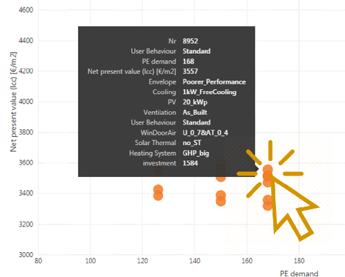
Step 3 – Hover effects of visualsIf the cursor is placed on a variant, users can find out more about a selected variant. The cursor needs to be placed over any visual element in the dashboard in order to view detailed data. |
|
|
Step 4 – Export dashboard dataData can be exported out of the visual via the Export data option. The resulting .csv file will contain all the data presented in a visual and will respect any filters applied to the data. |